Data Visualization
Purpose
Pepper was looking for a way to understand its operational and financial performance better. Traditionally, Pepper generated tabular, text-based reports and distributed them to relevant decision makers. They recognized an opportunity to use modern visualization tools to analyze their terabytes of data more quickly and accurately.
Method
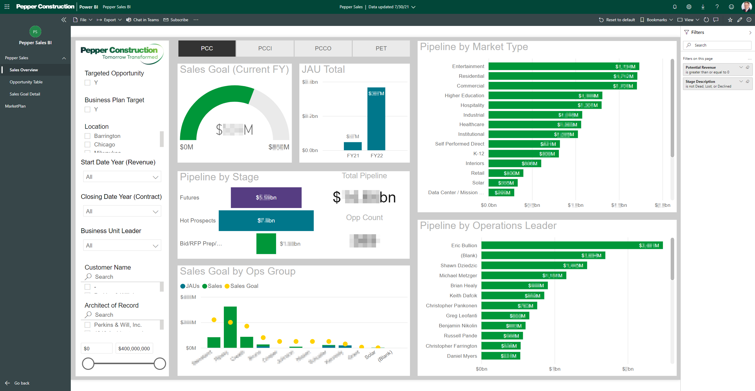
We chose to use Microsoft Power BI to build and share operations and financial visualizations within the company. I connected various Power BI reports to different data sources, including relational databases, RESTful APIs, and excel documents hosted in the cloud. I designed the visualizations to match the company’s branding.
Results
These Power BI reports serve as a real-time, interactive representation of the company’s operational and financial data. They unearthed perviously unseen errors and have driven many of the company’s recent process improvements and data corrections.

